Friday, July 30, 2010

Unstandardized Choropleth Map


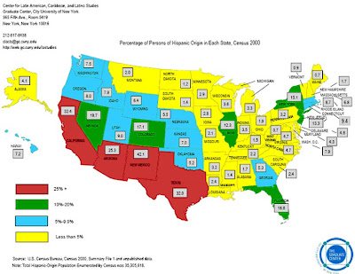
Unstandardized choropleth maps do not have any specific order. There are basically no rules like the other choropleth maps. The map above is not as organized as other maps.There is no specific ranking of the variables. The map represents the number of United States citizens with Spanish roots. You not tell which areas are the highest by just simply looking at the map.

Source:http://www.sitemaker.umich.edu/356.

Isotach Maps


Isotach maps are used to analyze lines of equal
wind speed on a constant pressure surface of 300 mb or 250 mb. The maps shows where the jet stream is located. The Isotach above was
issued by the National Centers for Environmental Prediction. It is a medium range forecast of 200 mb streamlines and isotachs.

Infrared Aerial Photo


Infrared aerial photos are used to display changes to the environment, forests, wetlands, bays and oceans and it can also be used to document and monitor such items as damage to roofs, insect activity, disease infested land, sites contaminated by toxic chemical, oil spills, and more. The image above is an infrared aerial photo of the mouth of the Parker River.

Isopach Map

Isopach maps illustrate variation of thickness within a stratigraphic unit. The isopachs are contour lines of equal thickness over an area.The map above shows the thickness and areal extent of Silurian evaporite basins in the Great Lakes area.

Standardized Choropleth Maps


Standardized choropleth maps are standardized to show comparisons of
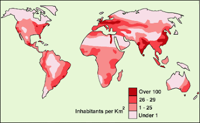
distribution among different areas. The above map is a standardized choropleth map of the United States Population Density.

Thursday, July 29, 2010

Nominal Area Choropleth Map

Nominal area choropleth map are used to display nominal (numerical) data. The map above show the Hispanic population in the United States. The data tells you that there are more Hispanics living in the western part of the United States.

Correlation Matrix


Correlation matrix shows the covariances between elements of a random vectors. The correlation above is based on research about the relationship between proteins and virus. The correlated behavior ranges from high represented in red and low, represented in blue.
Source: http://yin.che.wisc.edu/images.htm

Sunday, July 25, 2010

Isoline Maps


Isoline maps are maps with continuous lines joining points of the same value. The c
ontour lines can be curved or straight lines. The configuration of these contours allows map readers to infer relative gradient of a parameter and estimate that parameter at specific area. The map above is a representation of the Arctic free-air gravity.

Saturday, July 24, 2010

Univariate Choropleth

Univariate choropleth maps show a specific set of data. The map above represents the crime propensity of Portland, Oregon in 1992. The map shows that areas that are similar in suitability for the location of a drug trafficking are located in a band surrounding the CBD. The areas that are designated as drug free zones are surrounded by similarly crime groups.

Range Graded Proportional Circle Map


Range graded proportional circle maps are proportional circle map that us the circles based on ranges of data. The information is classified as equal quantiles, breaks, natural breaks, and minimum variance. The image above is based on river characteristics. The area of the circle is proportional to the channel width. The color of the large circle represents the color of the water. Descriptions of the bed material are determined by the position of the solid black circle inside of the black triangle. The example in the upper right is equal to a width of 500 yards.

Black & White Aerial Photo

Aerial photos are produced by exposing film to solar energy reflected from Earth. The image above is a black and white aerial photo. In this photo you can see several features of the area. In the left upper corner is a neighborhood. In the middle of the photo you can see two major roads, possibly major interstates.

Cartogram


Cartograms are maps that have some thematic mapping variables. Data is often based on statistical information. The Cartogram above is economical. It illustrates the distribution of wealth and power in the world. This cartogram has based the sizes of the countries according to their financial status.

DLG

DLG are Digital Line Graphs. The digital format standards are published by US Geological Survey for exchanging cartographic data files. These topographic graphic maps are produced in vector format. The image above is a DLG of a town in Georgia. The map gives a lot of detail about the town in Georgia major roads (red), topographic contours in pink, rivers in blue, and Trails in black.

Classed Choropleth Map


Classed Choropleth maps determine height and shading or color intensity of the bar for each map.It is usually based on statistical data. The map above has 5 classifications. The classifications are represented in different hues of green (light yellow to dark green). This map is also considered a standardized map.The purpose of the map is to show the amount in dollars spent on each student in the Public Education System of North Carolina from 1994 to 1995.

DEM


DEMs are digital elevation map. The maps give a three dimensional view of large areas. The map above is a DEM relief of Oregon. You can see a lot of geographical detail of Oregon by looking at the image above.

Dot Distribution Maps

Dot distribution maps use dot symbols to show the presence of a feature on a map. The maps rely on a visual scatter to show spatial patterns. The map above shows the effects of population on Lake St. Clair . Each yellow dot represents 2500 people.

Friday, July 23, 2010

LIDAR


LIDAR stands for Light Detection And Ranging. LIDAR is an optical remote sensing technology that measures properties of scattered light to find range or other information of a distant target. The LIDAR image above helped develop a three dimensional image of the September 11 Twin Tower (New York) catastrophe.

Wednesday, July 21, 2010

Isohyet Maps

Isohyet maps are created to show predicted rain fall in an area. The map above is an isohyet contour map. This map shows June 2010 rainfall distribution in 100 mm bands.

Cartographic Animations


Cartographic animations are created to
emphasize the existence of an occurrence at a particular location, emphasize an attribute of an occurrence, or represent change in a position. The image above is an illustration called Pangea. It show how the continents were once connected then separated into continents of today.

Planimetric Map


A planimetric map
is designed to show the horizontal positions of the area being mapped. The maps above are both examples of Planimetric maps. The map on the left is a two dimensional image and the map on the right is shaded three dimensional image. The map on the left is a display of Southern California and the map on the right is simply a ocean floor image. The purpose of these to two images were to show how physical base maps can be transformed into beautiful three dimensional planimetric maps.
Source: http://www.shadedrelief.com/planimetric/plan.html

Tuesday, July 20, 2010

Scatter Plot

A scatter plot is a graph that displays a set of bivariate information. The graph above is a comparison of income based on years of experience. All the values are represented by a dot. It shows that the more years of experience you have the higher your income.
Source: http://allpsych.com/researchmethods/correlation.html

NGM


NGM stands for Nested Grid Model. NGM's are regional forecast and analysis systems. The above image is a NGM from Louisville on January 17, 1994. The Bold straight line represents the path of cross-section used to depict a geostrophic circulation. The map is also considered an isotach map.

Isobar Maps


Isobar Maps are weather maps that use isobars to connect areas of the same air pressure. The maps are useful in locating high and low pressure gradients. The image above is a weather map showing the high and low air pressure in parts of the United State on On May 6, 1999. The map shows that there were some strong winds blown across western South Dakota and portions of northeast Wyoming. Each isobar represents a 4mb pressure difference. There were also 5 isobars over western South Dakota. The map also shows the direction of the wind.

Isopleth Maps

Isopleth maps give information about a particular geographic area by connecting contour lines of equal value to show change or differences. The map above is an example of a Isopleth map. The purpose of the map was to illustrate precipitation change in Spain. The level of precipitation increases outside of Montserrat and there is no precipitation in Barcelona.
Source:http://geographyfieldwork.com/DataPresentationMappingTechniques.htm

Proportional Circle Maps

Proportional circle maps are used to present a particular value or information with the use of circles. The map above is an example from the Zcech Republic. The circles are in the form of pie charts. The map is also considered a Choropleth map.
Source: http://geographyfieldwork.com/DataPresentationMappingTechniques.htm

Monday, July 19, 2010

Similarity Matrix


Similarity Matrix shows similarities and differences between variables. The Similarity Matrix above was data taken from an experiment that compared protein interaction similarities. Red colors show that the proteins had similarities and the blue colors show that the proteins had more differences.

Propaganda Map


Propaganda maps are a little similar to mental maps. The maps are used to pursue an idea, show power, give an example, or show emotions such as anger or fear. They are created usually created by distortion of reality. The Propaganda map above was taken from Life magazine issue January 26, 1953. The map was use to show the the danger of Western Europeans collaborating in with "East European communists" during the Cold War. The red creature on the map is pumping military supplies from the West into Eastern Europe, whom are the "Communist East Germany". This map was intended to bring fear upon the community and hate towards the Eastern Europeans.


PLSS Map


PLSS stands for Public Land Survey System. These maps are used in the United States to survey and identify land ownership. The image above is a statewide standardized PLSS. There are thirty public domain states according to the PLSS above.


Triangle Plot

A triangle plot is also called a ternary plot. It is usually based on three variables. The three variables plotted will always equal to a particular constant. The plot above represents percentages from a soil texture analysis. The two variables are sand, clay, and silt. The variables on this example equal to one hundred. This particular plot could use geologic purposes, to check the solubility of the soil, health purpose, agriculture, or construction.
Source:http://www.dplot.com/triangle-plot.htm

Flow Map

Flow maps use arrows to show size or direction of a variable. Flow maps can also be used to illustrate movement from one place to another. The flow map above show the " origins of asylum seekers" in the United States. The size of the arrows is a representation of the number of refugees. The arrows also show where the refugees were relocated. The map shows that a small number of South Americans traveled to Texas.

Chloropleth Map

Map A


Map B


Chloropleth maps are thematic maps that are displayed with a particular pattern or shading based on the area being displayed. The maps above are examples of Chloropleth maps. The maps represent the percentage of couples divorced in the United States in the 1980. Map a show the percentage by city and Map B shows the percentage by state. The data shows that more couples on the west coast were divorced than those on the east.
Source:http://www.pop.psu.edu/gia-core/divorce.htm

Bilateral Graph

Bilateral graph are visualization maps that shows two or more sets of data side by side or stacked on top of one another. The graph above was used to represent technical cooperation in Japan's environmental ODA. It has three sets of data. It shows the amount of people that are accepted are trainees, who come in as experts, and are JOCV's. The information was presented by the Ministry of Foreign Affairs of Japan. The purpose was to show how Japan has progress towards sustainable development in the Environmental field. The data presented was from the year 1994 through 1998.
Source:http://www.mofa.go.jp/policy/oda/category/environment/pamph/2001/oda.html

Windrose


Windrose are used to show wind conditions. Meteorologist use windrose to give a graphic view of how wind speed and direction are distributed in a particular location. The above image is an example of a 36 direction windrose of Maine. The windrose was used to show how wind can have an affect on air quality in Maine.

Lorenz Curve


The Lorenz curve is used to show inequality in a distribution of income values within an economy. If the Lorenz curve lies below the line of equality, the distribution of income will become more unequal. The image above is an example of a Lorenz curve. The green line represents the line of perfect equality, red line represents the Lorenz curve, and the blue line represents the line of perfect inequality. Note that the Lorenz curve is below the line of equality.

Mental Map


Mental maps are also called cognitive maps. Mental maps are based upon someones opinion or perspective of a place, concept, or idea. Mental maps do not have to be correct. The above image is a mental map of California from the Time Magazine (Issue November 2, 2009). The purpose of this mental map is to show why the state of California is important to the United States. This cover shows the audience that California has a great impact on technology. The state of California appears to be the inside of an electronic device.

Sunday, July 18, 2010

Social Network Map


The map above shows the relationship between social life and networking. The map was created to show how obesity could possibly affect whether the people that you socialize with have obesity also. The project consisted of 2,200 people who are come how connected. Each circle represents the persons size. Yellow circles represent people who are considered medically obese, green circles indicate people who are not obese and the lines represent relationships and families.


Friday, July 16, 2010

Thematic Map

The purpose of a thematic map is to show a particular pattern or theme about a specific geographic area. The image above is a thematic map of Montgomery county, Pennsylvania. The purpose of the map was to represent the concentration of African Americans (green) across Montgomery county. The demographic information came from the US Census Bureau (2000). The map above is also considered a chloropleth map. It contain additional features such as roads, interstates, and streams (blue).

Source:http://www.personal.psu.edu/ooo105/Geog482Project2.htm

Mappae Mundi

Mappae Mundi were maps created in the Medieval times. They were very symbolic maps and were based upon christianity. The most typical form was created in the Middle Ages. It was called the T-O map. The map consisted of three continents divided by seas, East was on top and Jerusalem at the center. The map above is a modern Mappae Mundi created for the Dover Castle. This is one of the first attemps to create a modern medieval map. The Mappa Mundi above has been re-created using paint made from ground up lapis lazuli (rare semi-precious stone) , malachite(copper carbonate mineral), a pigment known as 'dragon's blood', ink from oak galls, and 23.5 carat gold leaf. It was painted on a three foot by four foot handcrafted calfskin.

Source: http://www.telegraph.co.uk/culture/culturenews/5709231/12th-century-Mappa-Mundi-recreated-for-Dover-Castle.html

Cadastral Map

Cadastral maps give detail about a property or a specific area. These particular maps can give just about any detail about an area. The maps can show land boundaries, specific landmarks and features, zoning, and they can also tell the history of an area. The image above is a 1909 cadastral map of Olmstead Park in Portland. The map was used to show how the small area was connected to other small districts in Portland such as streets, water, and sewage mains.

Source: http://alamedahistory.org/the-map/

DOQQ

DOQQ stands for Digital Ortho Quarter Quad. DOQQ is a digital image that has the properties of an orthographic projection. The image above is a DOQQ of Austin, Oak Hill, and Montopolis, Texas. The DOQQ is in the UTM coordinates system (UTM zone 14). It is also a color infrared image.

Climograph


A climograph is representation of the relationship between temperature and precipitation plotted at monthly intervals. The images above are four climographs of different areas in Italy. The temperature is represented in Celsius on the right. The amount of rain is represented in millimeters on the left. The red lines compares the minimum and maximum levels of rain compared to temperature.
Source: http://chris-whel00.tripod.com/sitebuildercontent/sitebuilderpictures/climate.jpeg

Star Plot


Star plots give you the ability to compare multiple variables for each observation at once. The plot above is an analysis of automobiles from 1979. With this data we can analyse each individual type of automobile or we can compare all of them. The different values are used to represent the value of the automobiles. One represents the price, two represents mileage, three represents 1978 Repair Record, four represents 1977 Repair Record, five represents Headroom, six represents Rear Seat Room, seven represents Trunk Space, eight represents Weight, and nine represents Length. From the data shown you can see that the AMC Spirit was not the best value at that time.

Stem and Leaf Plot


The stem and leaf plot show the frequencies in which particular classes of values occur. The image above is a display of grades made on an exam. The left column of the plot is considered the stem and the right column is considered the leaf. A combination of the numbers with show the grades made on the exam. For example 3/5 is equivalent to 35. The grades are plotted as followed 35, 59, 60, 70, 72, 73, 79, 82, 84, 87, 92, 96, 96, 98, 98, 98, and 100.

Source: http://theschoolpad.blogspot.com/2008/03/guide-to-tree-diagrams.html

Parallel Coordinate Plot

Each variable is graphed on a vertical axis on a parallel coordinate plot. There is a data element plotted as a connected set of points on each axis. They can be used to explore relationships among different variables. The plot above is from a study on the characteristics of primates affected with HIV. The plot shows the weight difference between the healthy and affected primates. The scattered areas of pink show that the healthier primates weighed more than the primates affected with HIV.

Source: http://dayprofitsolutions.com/article-NIH.htm

Bivariate Map


A bivariate map is a display of two variables on a single map by combining two different sets of colors.The image above is a map of the percentage of votes for John Kerry in the 2000 presidential election versus each county's population in 2000. The two variables are assigned specific colors. The percentage of votes for John Kerry is represented in green and the county population is represented in lavender.

Thursday, July 15, 2010

Box Plot

A box plot is also known as a whisker diagram. A box plot is a graphical summary of a set of data. Box plots are used mostly when comparing two or more variables. The diagram contains the median, average, and measures of dispersion. The diagram above is a side-by-side box plot. It compares the number of births in a hospital in Canada by days of the week (7 days). The tails show the minimum (bottom tail) and maximum (top tail) number of births and the mid line is the median.

Population Pyramids

Population pyramids are displays of age and sex distributions in given regions. The population pyramid above uses the New Zealand census populations for 1901 and 2001 to project the population for 2101. The median age appears to increase by almost ten every century.

Source: http://www.population.govt.nz/discussion-pages/population-ageing.aspx

Histogram

A histogram is a display of tabulated frequencies. The chart above is an image of employee monthly salary rate. The charts contains two variables the number of employees on the left and the salary made on the bottom of the chart. From the chart you can see that an average or most of the employees make &2,100 and $4,290 a month. There is only one employee that makes over $24,000, which is most likely the owner of that particular company.
Source: http://quantmeditate.blogspot.com/2005/03/creating-histograms-using-sql-function.html

Doppler Radar

Doppler Radars are used to determine velocity data about objects in a specific area or distance. Doppler Radars can be used for aviation, radiology, and the speeding devices used by policemen. The most common use is for meteorology. Meterologist use Doppler Radars to determine weather and storms by taking atmospheric profiles of the clouds and the motion and composition of particles in the air. Above is an Doppler Radar image of Hurricane Frances taken on September 4, 2004. From this image you can see that the eye of the storms is in between Fort Pierce and West Palm Beach of Florida. The colors from the DBZ scale shows the intensity of storm.